founded in 1999, designboom is the world’s first digital architecture and design magazine, and, after more than 20 years online, you might ask — what make designboom’s content so unique? our editorial team is made up of more than 200,000 active contributors from around the world: designboom readers.
designboom reader submissions invites creatives and makers — regardless of place, position, prestige, religion, nationality, or gender — to communicate their work to a huge, international audience. this horizontal distribution of information means that cultural conversations are developed directly by our readers, and don’t follow any fixed hierarchical systems or chains of command. creatives from all corners of the globe are welcome to contribute as part of a positive commentary on the world’s creative scene, and are invited to present their projects to designboom’s readership: an audience of professionals, students and design enthusiasts that reaches 3.5 million monthly. over the years, we’ve received submissions that have helped shape communities, educated future generations, supported human history, and simply shared a smile.

see some recent examples of designboom reader submissions from across the globe below, and publish your work, promote your project, and share your vision with the world, here.
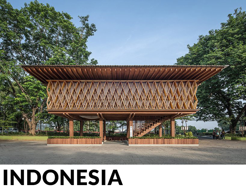
SHAU forms an elevated ‘microlibrary’ from prefabricated timber in indonesia
developed around passive climatic design and built entirely from FSC-certified wood, the intervention not only encourages reading in a low-income neighborhood, but also serves as an educational spot for timber construction techniques. the whole building is elevated like a traditional ‘rumah panggung’ (house on stilts).
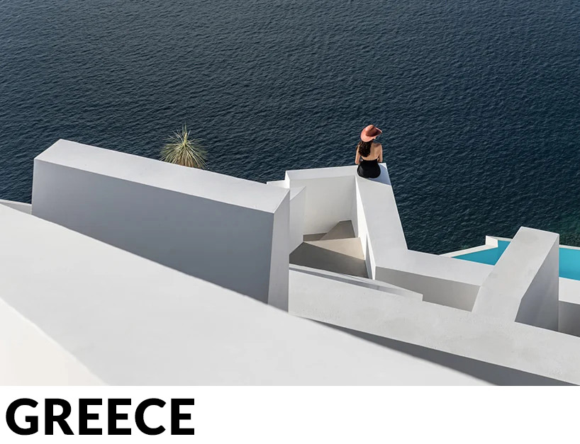
kapsimalis architects builds idyllic ‘saint hotel’ into the caves of santorini
the project saw the reconstruction of existing buildings on the cliffside to create an idyllic hotel complex in keeping with classic cycladic architecture. built over six levels, the finished complex boasts unobstructed views, providing guests with the ultimate santorini experience.
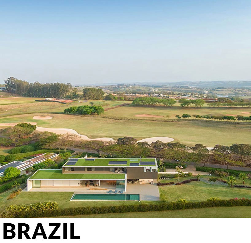
studio arthur casas composes JY house with two separate volumes in são paulo
this vacation house is divided into two main volumes, displaced from one another. the ground floor contains the entire social area, which is fully integrated with the exterior, opening to the view of the golf course just ahead, while the upper volume accommodates the more sheltered, private suites.
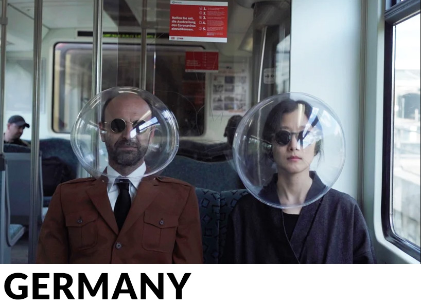
plastique fantastique’s ‘isphere’ face shield reminds of 50s sci-fi comics
considering the effect of the COVID-19 pandemic in modern everyday life and human interaction, plastique fantastique has created a transparent spherical mask that protects the whole face. the design is influenced by the science fiction comics of the 50s and the creations of the utopian movements of the 60s.
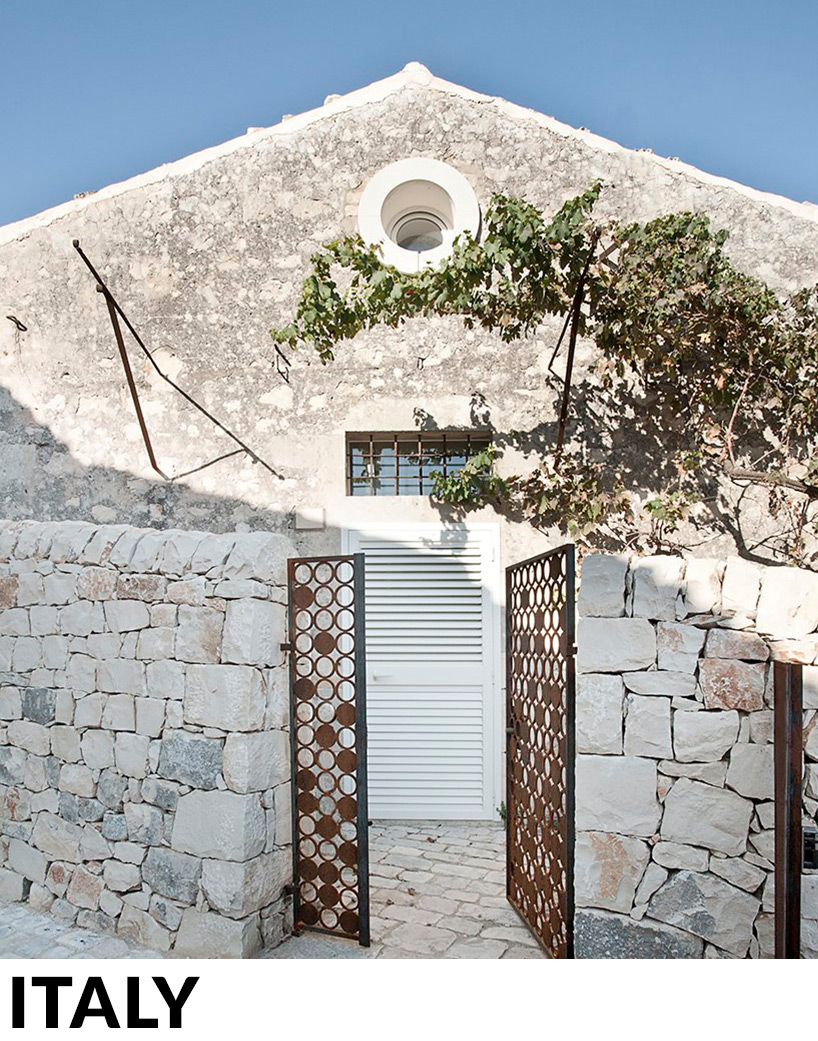
this little family house in sicily is carved out of an 18-century building, by zerozero
this sustainable project combines history and technology, achieving near-zero energy building status, whilst respecting and enhancing the original building. new surfaces and volumes delicately but assuredly cover the historic building protected by its stone carapace and instill new life within it
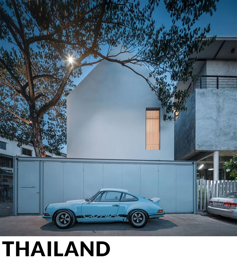
BHX architects references children’s drawings to design the ‘basic house’ in bangkok
the shape of the building came from the simplest inspiration of how children draw a ‘basic house’: a triangular roof, with one door and two windows. BHX architects fulfilled that dream while staying true to their minimal roots, which gave birth to the design – a home that perfectly aligns with the personality of the inhabitants.
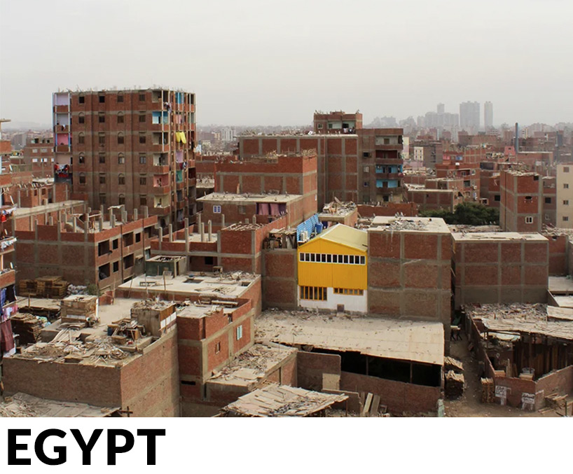
ahmed hossam saafan builds a yellow cultural center in one of cairo’s most populated slums
as well as providing a platform and cultural center for the people of the region, the building also aims to create a bold landmark, which it effectively does through the application of bright yellow metal cladding. the project comprises an art studio, a gathering space, an administration office and a theatre and workshop area.
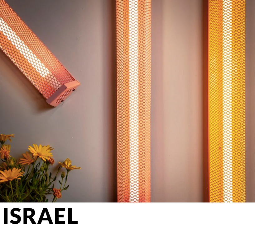
ziggy by studio beam is a colorful LED light made from metal and expanded mesh
available in a range of colors, from sunflower yellow to spearmint green, the light fixtures can be either wall-mounted or suspended from the ceiling as pendants, offering a versatile light fixture for both work and home environments.
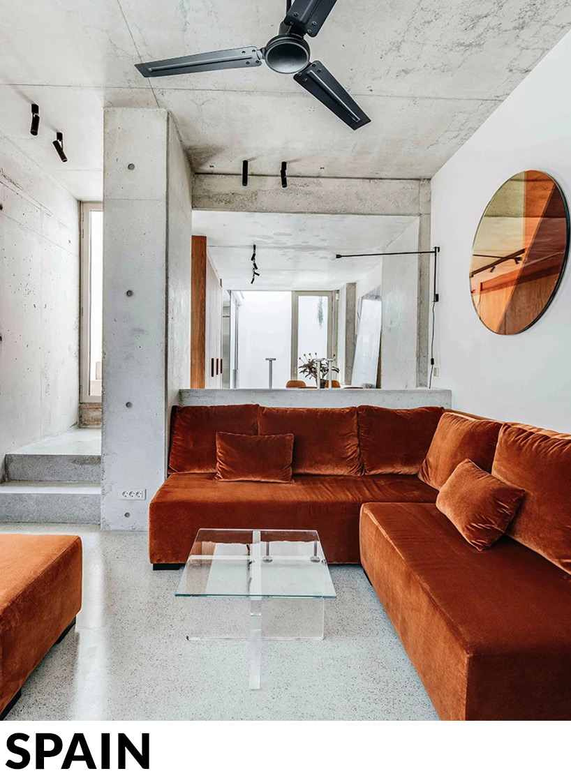
barbara appolloni converts a garage into a stylish ‘shoebox’ apartment in barcelona
designed from the inside out, the original building has been shaped into a ‘shoebox style’ apartment where architecture becomes part of the interior decoration, resulting in a series of beautifully contemporary living spaces. with frameless glass openings and delicate railings, the architecture focuses on removing barriers by removing the divisions between house and nature.
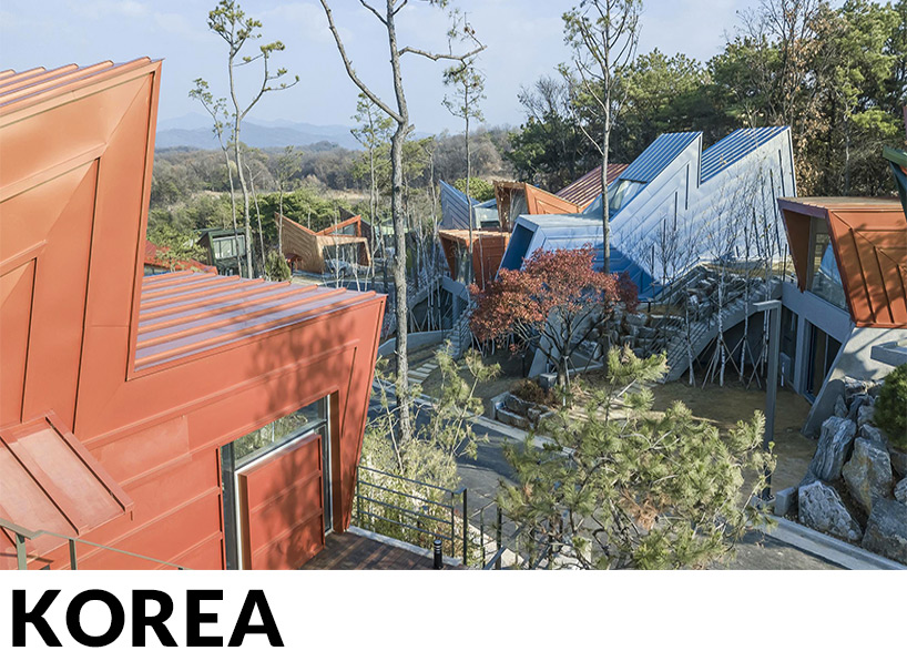
IROJE KHM forms zig-zagged colored townhouses for ‘stella fiore’ project in south korea
the concept revolves around the idea of forming ‘architectural stars’ which are shaped by the space requirements of the brief. furthermore, paths and streets have been constructed in between the townhouses, resulting in a village-like feel to the entire development.
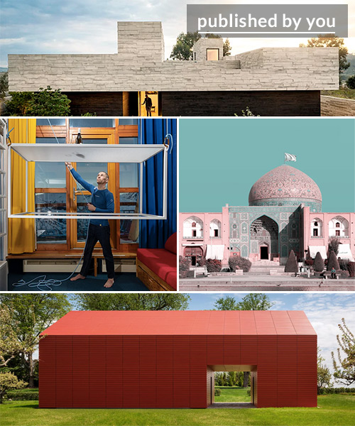
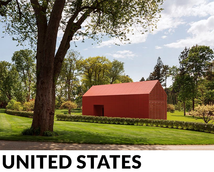
the red barn by roger ferris + partners reinterprets traditional new england architecture
a contemporary reinterpretation of a building type seen across new england, this barn recalls history, while simultaneously being very much of its own time in materials and detailing. the gabled form was selected as an appropriate building typology for a rural site, while red was specified for its reinforcement of the barn imagery.
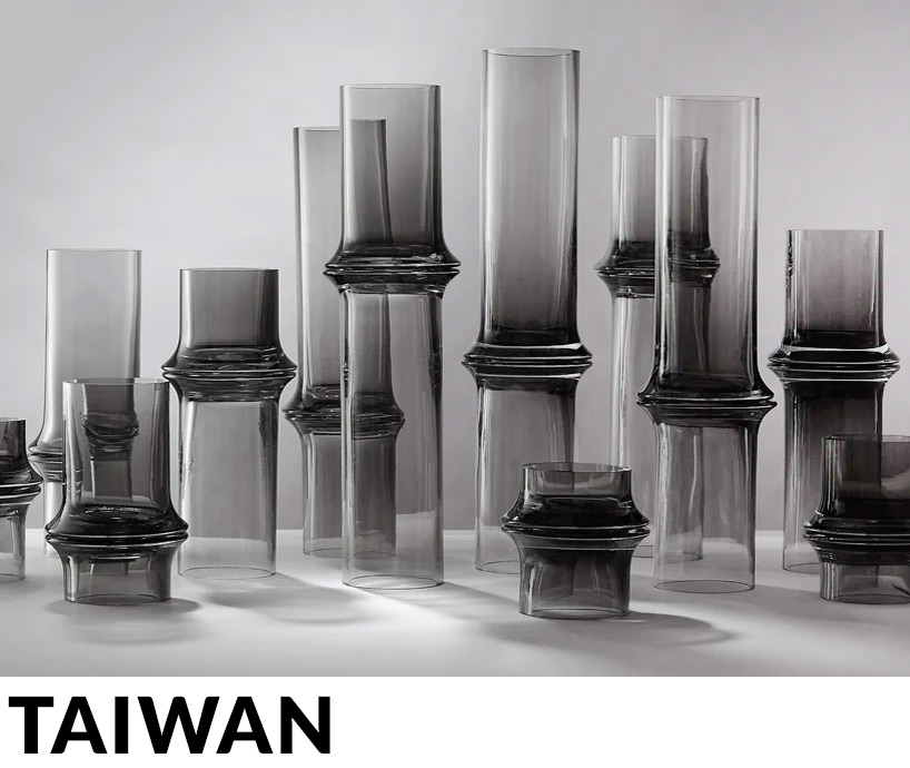
hsiang han recreates the organic form of bamboo in mozhu glassware collection
inspired by the organic form of bamboo and oriental bamboo ink wash painting, the project uses artisanal craftsmanship to create a modern home decoration. during production, the artisans need to blow two identical pieces of glass at the same time, and then join them together.
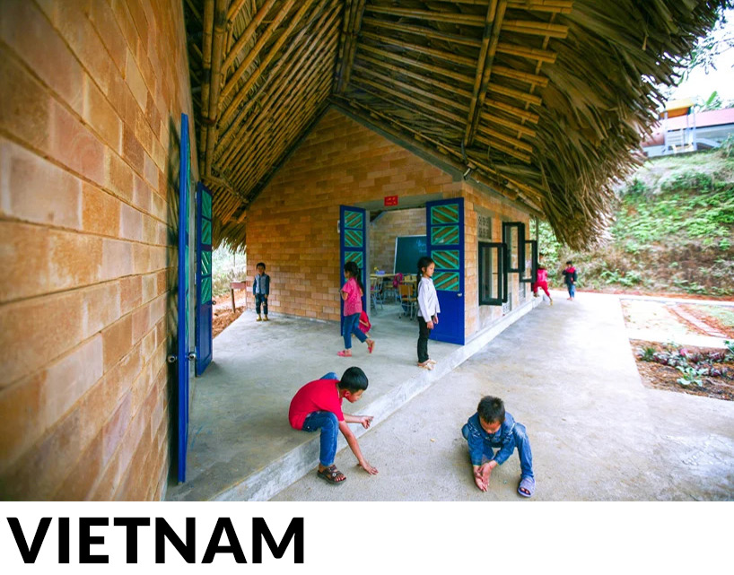
1+1>2 architects employs local materials and labor to build dao school in vietnam
the modest construction utilized local labor and materials, including thatched roofs, stone and earth bricks that were produced on site. designed with issues of climate, environment, and local identity in mind, the walls are made using a brick system that makes use of daylight and captures the wind to cool the spaces down in summer.
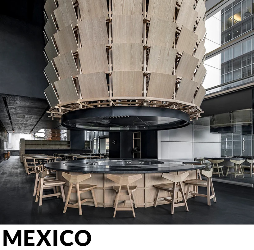
esrawe studio references samurai armor to design japanese restaurant in mexico city
inspired by the ‘subtlety and sobriety’ of traditional japanese craftsmanship, the intervention transports patrons into a calm and serene atmosphere, swathed in natural and black-colored timber. esrawe studio has applied a consistent palette of monochromatic colors and materials in an effort to emphasize the volume of the space, while also unifying each element of the interior.
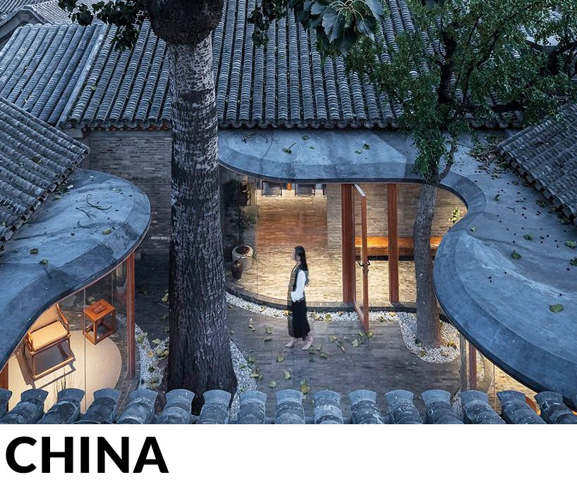
archstudio fuses old with new to renovate a traditional siheyuan residence in beijing
the architects embedded a veranda – a basic element of traditional chinese architecture – into the old siheyuan to connect the seven separated pitched roofs. the veranda functions as a circulation route, reshaping the spatial pattern and layers, and providing a playful walking experience as well as impressive views.
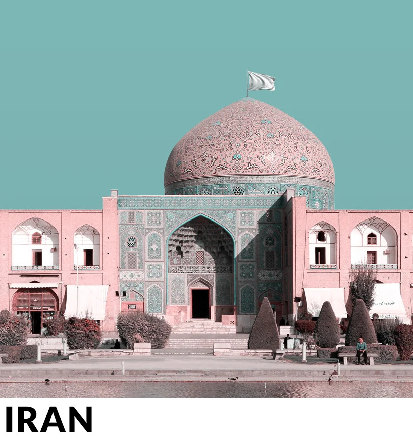
mohammad hassan forouzanfar raises a white flag across world heritage sites in iran
the conceptual project imagines white flags raised over UNESCO-listed and historic world heritage sites in iran, highlighting the importance of these irreplaceable buildings and landscapes. making a subtle yet powerful message, the flags highlight how important elements of a country’s history and culture can be caught in the crossfire between conflicting nations.
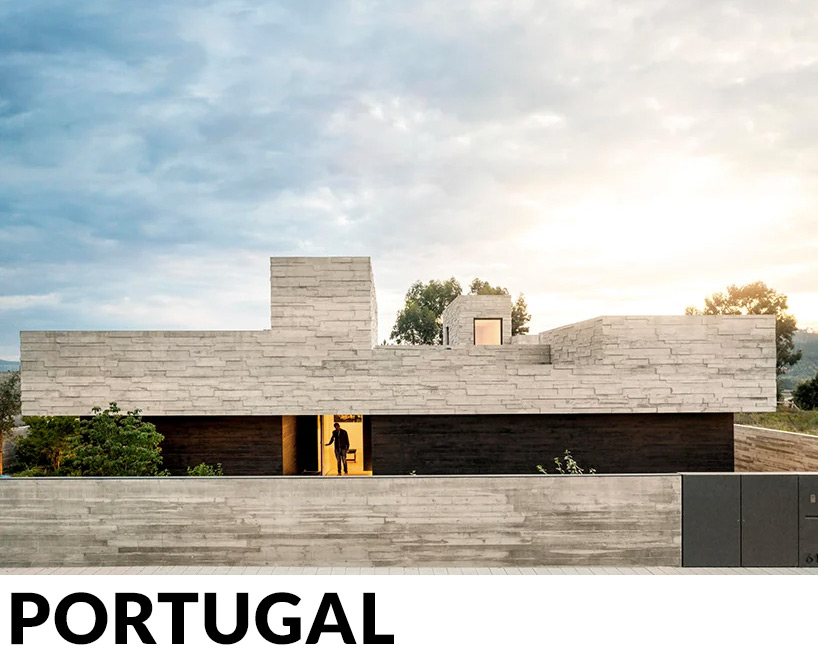
spaceworkers designs a ‘house for books’ with a monolithic roof in rural portugal
the client approached the architects with one simple challenge: to design a space for books. after fleeting notions of classical libraries with sliding stairs to reach high bookshelves, the team followed this idea to create a tall volume capable of generating the necessary composition and hierarchy of interior spaces.
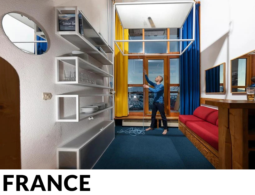
coudamy refurbishes 19 sqm les arcs apartment with a space saving ‘flying table’
the architects carefully conserved and refurbished one of the apartments at les arcs 1800 ski resort — a classic example of modernist alpine architecture designed by charlotte perriand. bringing space saving strategies into the compact 19 sqm studio, coudamy inserted a radical intervention fitted with a system of pulleys, which lifts a table up into the double height ceiling when not in use.
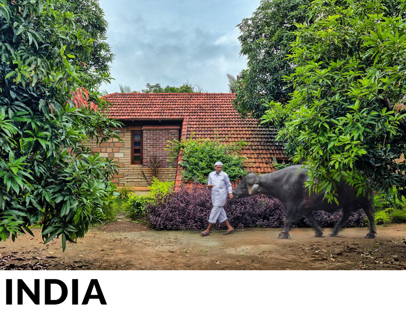
connected to the ground, the sloping roofs of these cottages in india bridge nature + architecture
the project centers around the principle of vernacular architecture, and is based on established, honest, and time-honored construction techniques. in particular, the roof is made from terracotta, a material associated with the memory of many family generations, and a representative image of almost half million indian villages.
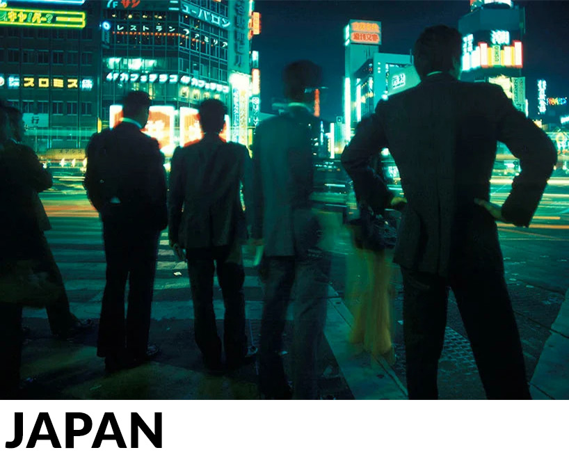
tokyo in the 1970s, a pre-blade runner city, in amazing unseen photos by greg girard
using a combination of color and black and white compositions, the photographs perfectly depict the ‘pre-blade runner’ era. capturing both the people and the urban landscapes of tokyo and yokosuka, the series transports viewers back in time, evoking a sense of what it was like to visit, or live in, japan’s cities during the 70s.
PRODUCT LIBRARY
a diverse digital database that acts as a valuable guide in gaining insight and information about a product directly from the manufacturer, and serves as a rich reference point in developing a project or scheme.
