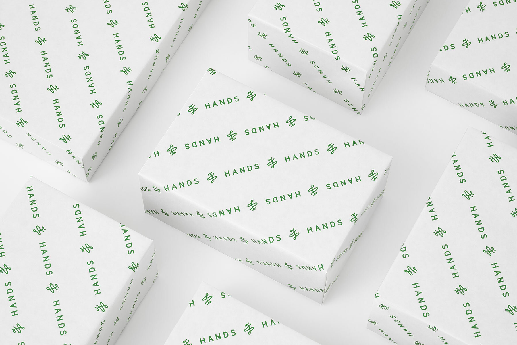
the new logo replaces the previous ‘hand wings’
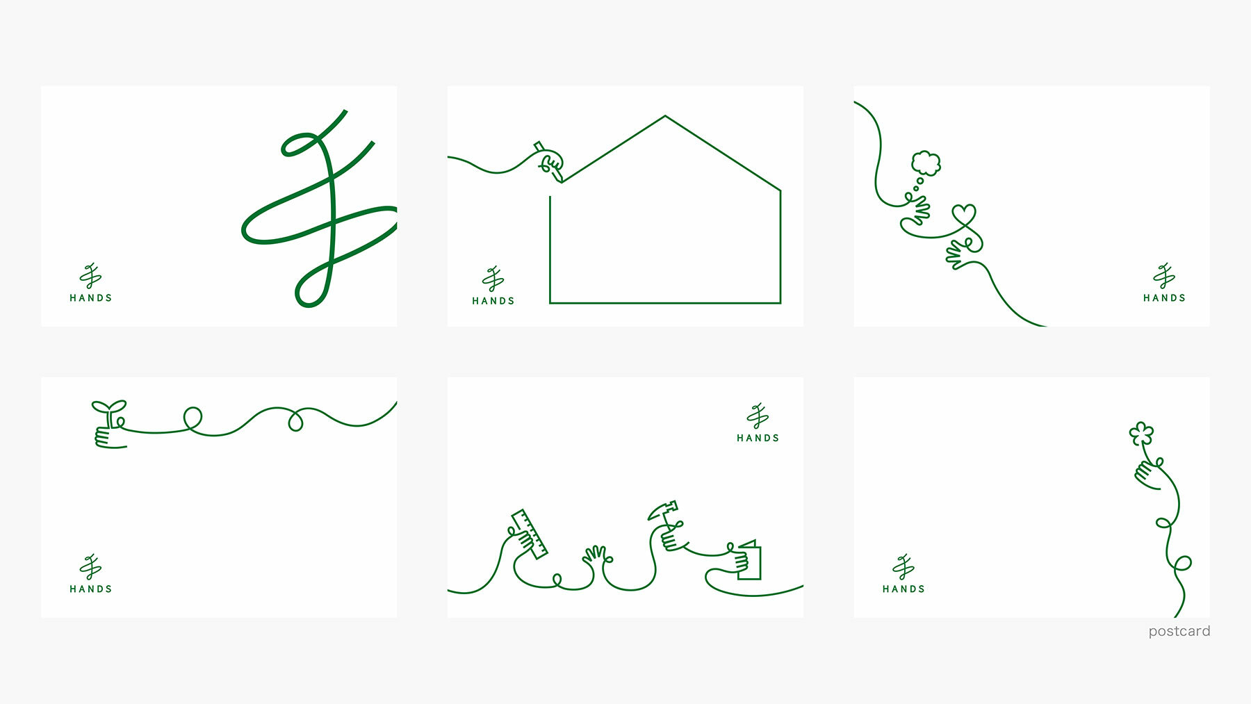
the designers at Nendo employ a calligraphic, single-stroke language
KEEP UP WITH OUR DAILY AND WEEKLY NEWSLETTERS
PRODUCT LIBRARY
milan's salone del mobile is back in full swing for its 62nd edition, taking place from april 16th to 21st, 2024.
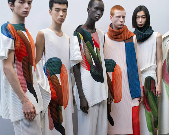
the collection transforms bouroullec's vibrant strokes into dynamic colors, organic forms, and intricate pleats, adorning models in shirts, coats, and scarves.
our top 10 design product picks of 2023 include playful and thought-provoking solutions, including whimsical furniture and sustainable toilet paper substitutes.
connections: 15
MycoWorks' xavier gallego and YUME YUME's eva korsten walk us through their collaboration and the promising future of mycelium-based fashion.
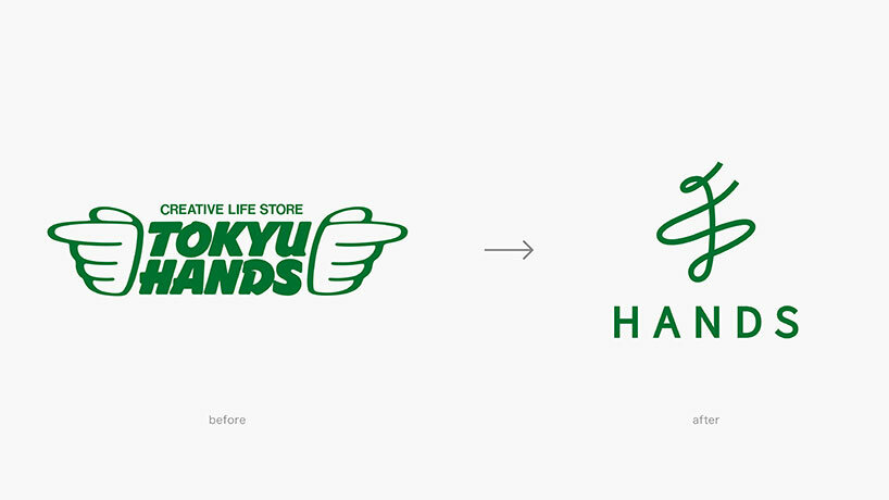 images by Masahiro Ohgami, courtesy Nendo
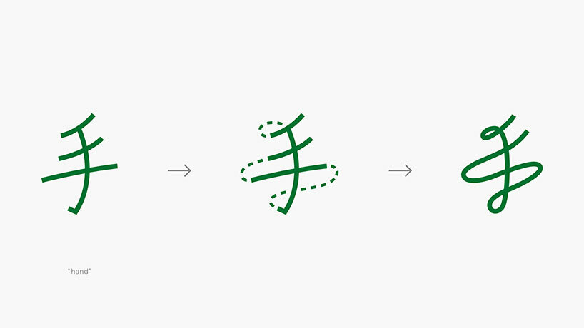 the japanese character meaning ‘hand’ is transformed into a single-stroke logo
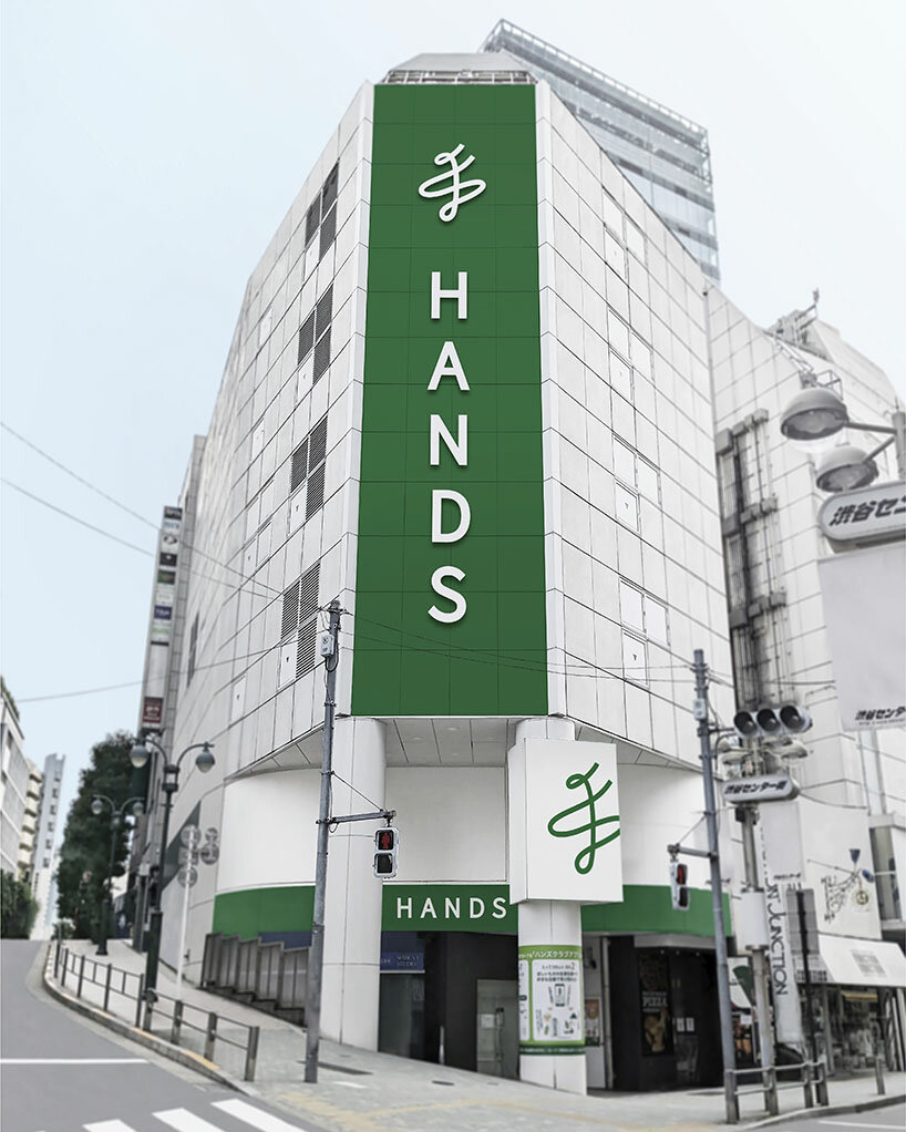
 Nendo has maintained the company’s iconic nickname and green color
 the minimalist design delivers a modern identity to the nearly fifty year-old company


